Next Level Resource
Next Level Resource is a coaching and consulting business started by Kathy Jeffery in 2003. Her initial clientele was individuals looking to better their resumes, interview skills, and life prospects. In over a decade of her practice she’s earned a Master’s in Communication and professional certificates in coaching and added team-building retreats, HR consultancy, and executive coaching to her repertoire. Considering her personal and small business’ growth, Kathy wanted to rebrand in order to create a new, revitalized look and feel for the company that reflects her vision and expanded business scope.
Client
Next Level Resource
Services
Rebranding, Logo Design, Business Cards, Website Design, Photography
Original Brand Attribute:
Logo
During our initial rebranding discussion Kathy and I talked about what she liked about her original brand identity. Three things stood out for her:
- The arrow conveyed a sense of progress and movement towards something better. This was treated as a non-negotiable.
- Orange was exciting and signified change. However, she was cautiously open to changing it.
- The tagline “Taking You Where You Want to Grow.”


Logo Redesign
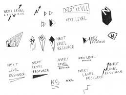
Next Level Logo Sketches
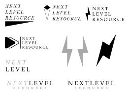
Next Level Logo Digital Sketches

Next Level Logo Draft
Logo Drafts
Though sharp angles are good at grabbing attention, instinctively pointed features feel dangerous. Because Next Level Resource is a people-centered business, I rounded the angles for a higher level of comfort.
Next Level Logo Greyscale
Recoloring
I chose the principle color to be purple, the exact opposite of orange, to acknowledge Kathy’s personal and professional milestones since the start of her business. Though orange is visually stimulating, purple better represents Kathy’s wisdom and focused approach.

cmyk 75 100 0 0
rgb 102 45 145
hex 662d91

cmyk 0 0 0 60
rgb 128 130 133
hex 808285

cmyk 0 0 0 100
rgb 35 31 32
hex 231f20
Final Logo
Final Next Level Resource Logo
Next Level Resource Logo for limited UI
I created a style guide that details how Next Level Resource should use their logo and other branding elements.
Original Brand Attribute: Business Card


Redesign
I reduced the business card to the include the most pertinent information for client conversion- Kathy's contact information and website.

Original Brand Attribute:
Website
Screenshots of Next Level Resource's Original Website
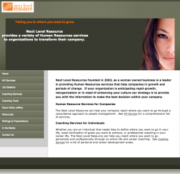
Homepage

About Page

Contact Page
Recreating the Website

Devi C.
As an experience high-end event planner for large corporations, Devi wants to start her own San Francisco events company so that she can work for herself and earn more.
Profile
Age: 43
Occupation: High-End Corporate Event Planner
Income: $95,000
Residence: San Francisco
Education: MS in Communications
Other Info:
Enjoys Dining Out
Appreciates Interior Design
Helps Support Her Parents
Goals and Needs
- Maintain Income
- Defined Goals and Steps
- Business Advice
- Realistic Timeline
Pain Points
- Needs help with business paperwork
- Concerned about loss of income during transition
- Nervous about surprises and setbacks
Original Website's Taxonomy

After some discussion, the stakeholder was willing to reduce the content which led to a more streamlined navigation and a clearer message.
New Website's Taxonomy
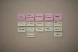
As Kathy is the face and backbone of Next Level Resource, I included an introduction to Kathy and her services, testimonials, a scheduling calendar, and a contact section for questions- all information and resources Devi would need as an introduction to Kathy’s coaching.
User Demographics
Kathy earns new coaching clients via referrals and in person at networking events. Though HR Consulting is a large part of her business, the users who are most likely to access her website visit either to learn more about Kathy and her coaching services or schedule a consultation or appointment.
Goal-Oriented
Users usually have a goal in mind or need help refining their goals.
Ages 28-50
Users tend to be more mature adults in the midst of their careers.
Highly Educated
Users are highly educated and have a good amount of experience in the workforce.
User Testing
For our first round of user testing, I assigned a task and asked questions to two people who matched the user demographic. Soon after, we had business constraints which required an early launch. This website is still a work in progress.
The Goal
To find out how useful the website is at informing users about Kathy and her services and how easy it is to schedule a consultation or appointment.
Questions Asked
You were introduced to Kathy by a friend. Kathy provided you with her contact information and you decide to check out her website because you might be interested in having a coach.
- What do you think of the information provided?
- How was your experience?
- Let's say you're interested in a consultation. Please schedule a consultation for any date available. How was your experience?
Key Takeaways
- Users thought the information provided was organized logically
- Users did know exactly what they were being asked to schedule in call-to-action
- Users found the appointment form confusing
User Testing Quotes
Changes Influenced by User Testing
Users were unsure of exactly what type of consultation they were being asked to schedule in the call-to-action, as it’s only the top of the page and they would not yet have had a chance to learn about the services offered. This specification was made on the off chance a consultation or workshop client accessed the page.

Call To Action Before User Testing
In order to clarify what the users were being asked to schedule, instead of making a change to the tagline (an important brand attribute to the stakeholder) I made a change to the button’s text.

Call To Action After Testing
The original scheduling form didn’t ask for a name up front and offered various levels of one-on-one coaching packages not explained in the site. These packages would be explained and offered during the consultation.
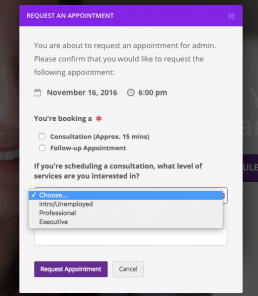
Scheduling Form Before User Testing
The updated form only requires a name, consultation or follow-up appointment, and requests a phone number for consultations or new clients.
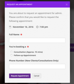
Scheduling Form After User Testing
Final Website
I replaced the header images of the woman in the original website with portraits I took of Kathy at a friend’s home in San Francisco. This website is still a work in progress.
