

General Electric
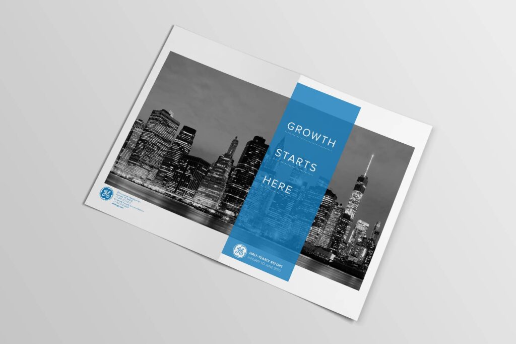
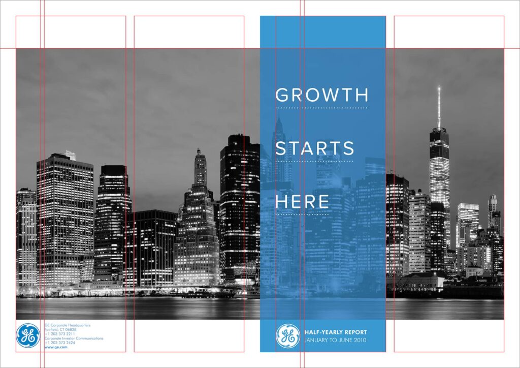
The aim of this brief was to design a half-yearly report for the company’s shareholders. The client’s motivation was to convey GE’s progress this year, thus far, as well as its general financial stability since the recession. I was provided with copy and a logo. Being a content-heavy brief, I utilized a symmetrical, two-column grid to boost readability, structure, and balance various elements within a small space. I added a few graphic elements (graphs, a chart, and a number graphic) to contrast the body copy. Concerning type formatting, I also used GE’s blue (PMS 3005) and an otherwise neutral palette to convey a sense of financial security.